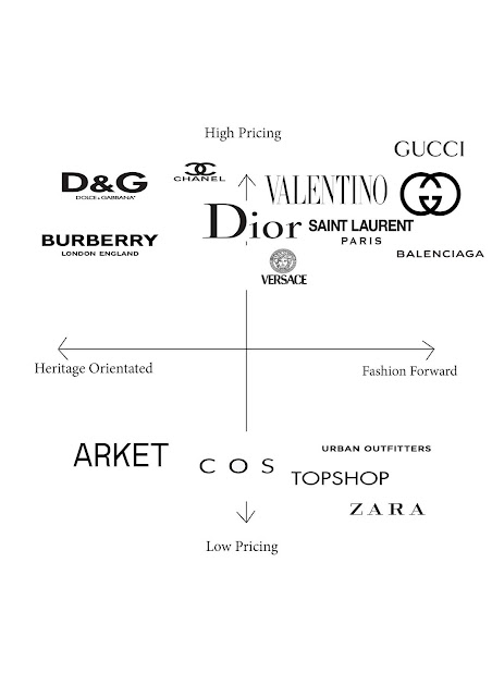
Updated Brand Positioning Map
As part of my feedback from my presentation, I was told to update my brand position map. The brands shown on my previous brand positioning map were too big and close together. This meant that it would be hard to for other people to interpret. Thus, in the updated map, I made the brand names smaller and more spaced out, so it would be easier to understand.
Another point from my feedback was the Dolce & Gabbana should not be an extreme on the map. For example, I had Dolce & Gabbana as the most heritage orientated brand, whereas it was suggested that it should be nearer the middle. This is so people can then compare D&G to other heritage orientated brands.
Here is the newly updated brand positioning map, with the blog post including the previous brand positioning map linked below.
Link to the previous brand positioning map:


Comments
Post a Comment